Grand unification dashboard
Project: DevOps Dashboard | Company: Nordstrom | Group: DataVision | Team: 1 Senior Manager, 1 PM, 1 front end developer, 5 back end developers | Title: Senior UX Designer | Duration: 1/17 - 4/17, Contract (Filter) | Location: Seattle, WA

Vision
Nordstrom, the luxury department store chain with 14B annual revenue, has a thriving online business. The 65 development teams responsible for their sites however were working at a disadvantage using an ad hoc mix of off-the-shelf DevOps dashboards. Further, their troubleshooting tools were outdated and poorly designed. Nordstrom IT managers envisioned a unified dashboard for advanced analytics and visualization creating efficiency and transparency throughout the organization.


The existing tools were outdated internal tools and off-the shelf dashboard products
My role
The DataVision team was formed out of the older tools team to execute this vision. I joined a few weeks before project kick-off, giving me time to ramp up. As the UX designer, my greatest challenge would be to Integrate all of the monitoring and troubleshooting tools that developers needed into a single system. Though my contract was for just four months, my completed designs would require several quarters to build.
Process
Kick off was a full day off-site meeting with the entire team, planning the MVP and project schedule for two quarters. We would work in month-long sprints, with me working ahead doing user interviews, iterating and providing designs for development. I worked closely with the front-end developer on implementation.
Research
In the initial research phase, I interviewed developers to understand how they used existing dashboards and tools. During the design phase, I used Adobe XD and created online clickable prototypes for user testing, asking users to think aloud while 'walking' us through. A PM watched remotely and took notes. This process yielded invaluable insights leading to improvements in the product.
Ideation and Design
I kept the project in wireframes and sketches for as long as possible while working out major challenges. These included:
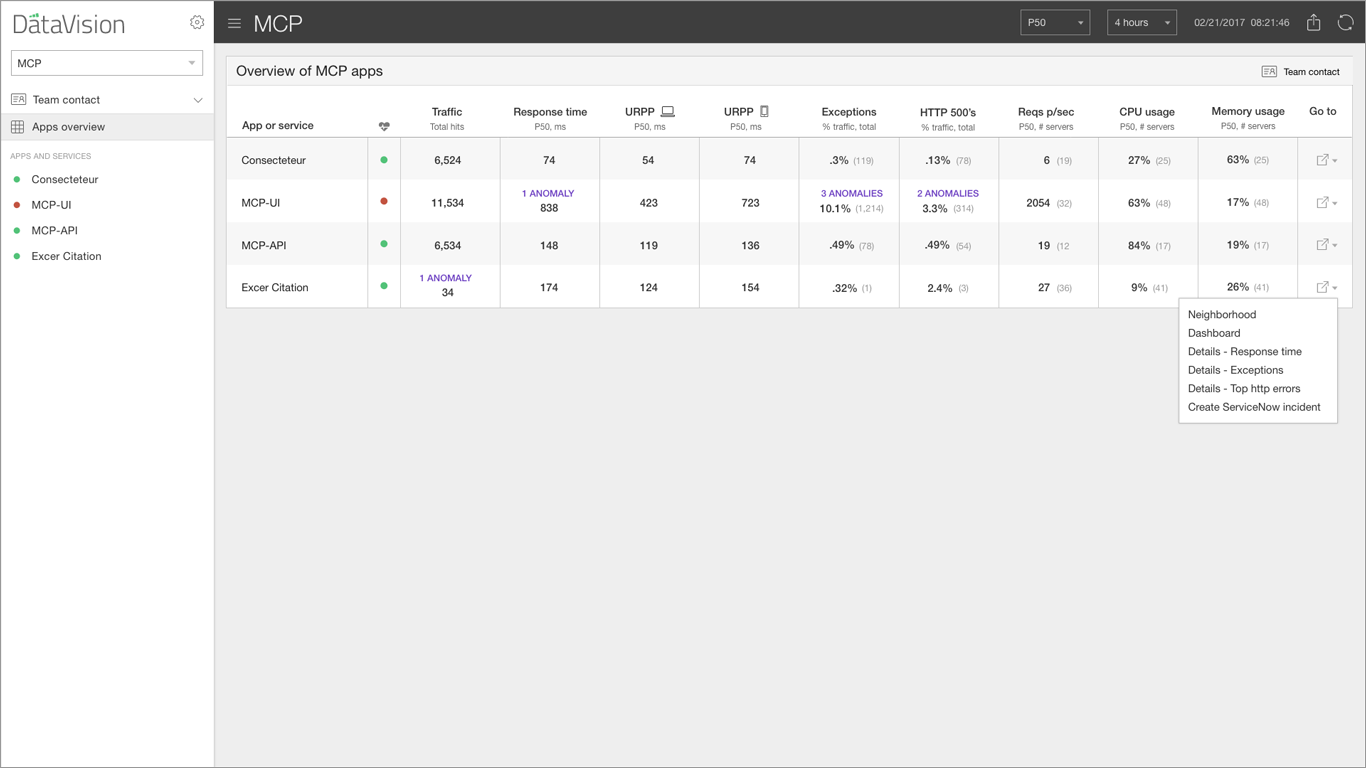
Navigation and information architecture
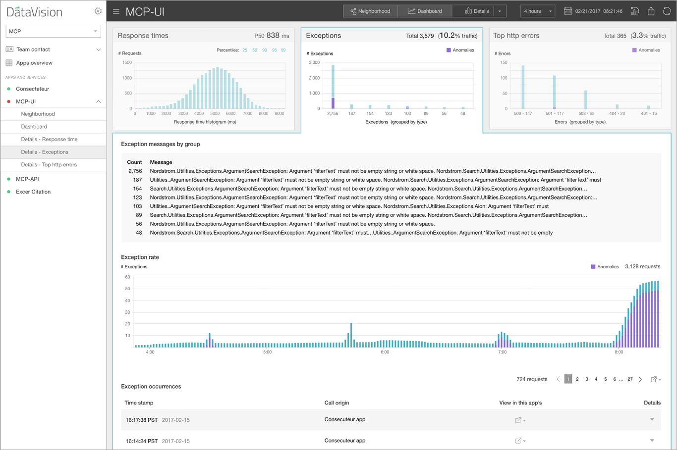
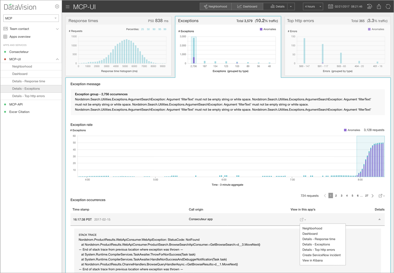
Developing a workflow for users to move from monitoring to investigating
Enabling developers to maintain situational awareness for their many apps
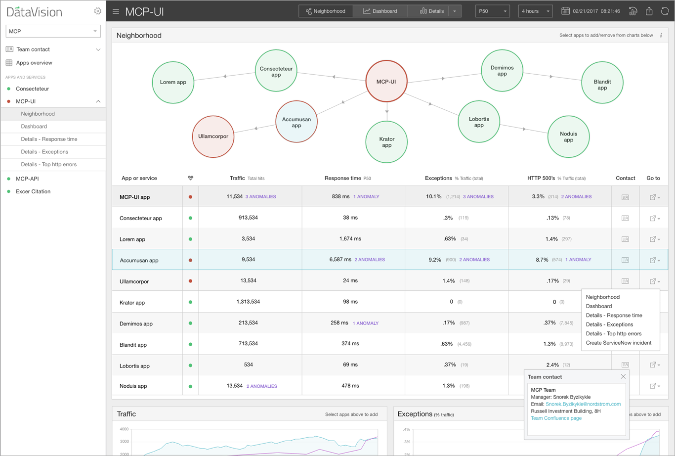
Monitoring "neighborhoods" or ecosystems of interdependent apps
Graph selection, metrics, prioritization, and interactions
Achieving extreme information density to include server usage metrics in the dashboard
Representing predictive artificial intelligence and anomoly detection on charts
Selecting dates and drilling into time spans

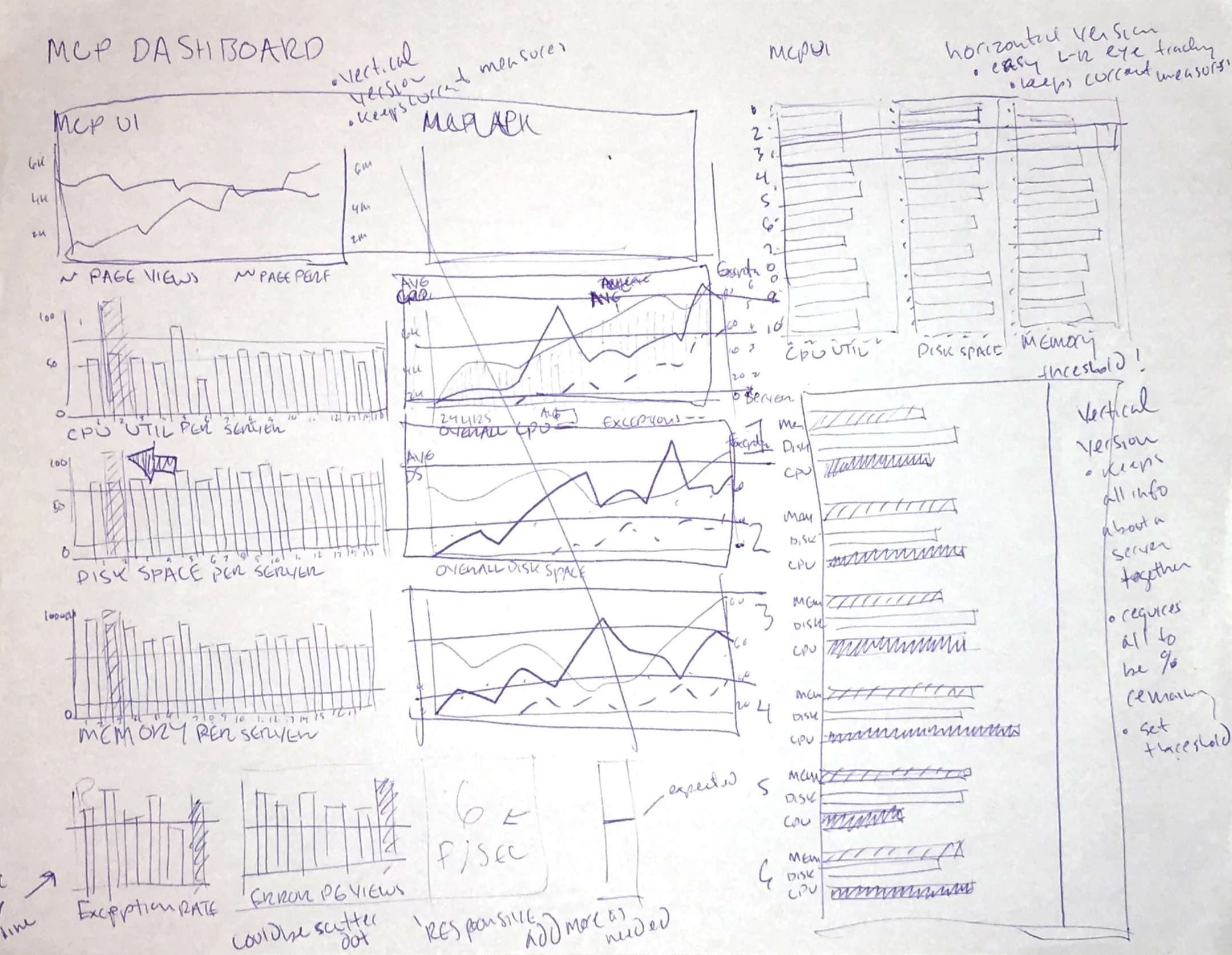


Sketches, wireframes and higher fidelity versions
Outcome
I delivered finished designs under the wire as my four month contract came to an end. With a great manager and team, I was amazed at what we'd accomplished to improve IT at Nordstrom. DataVision continues to generate excitement and onboard teams. The development team has stayed true to my design vision as they build the complete feature set.
Final Designs