Microsoft UNI 2.0
Project: UNI 2.0 | Company: Microsoft | Group: Windows Devices Group, Design R&D | Team: 1 Program Manager, 2 PMs, 2 front end, and 4 back end developers | Title: Senior UX Designer | Duration: 10/15 - 6/16, Contract (Allovus) | Location: Redmond, WA

Vision
Microsoft, based in Redmond, WA had hundreds of software products, and thousands of UX, VX and interaction designers iterating on their next releases. But in many studios, there were perennial problems weighing down the design process:
Lost and hard to find files hidden away on hard drives, servers, and dropboxes.
Onerous sharing, with too much time spent saving images and creating decks.
Uncertainty about the origin, stage, and status of design files.
Virtually everyone at Microsoft had a stake in improving the process:
Managers and executives needed easy access to designs to make decisions.
Designers needed ready access for crits, cooperation, reference, and inspiration.
Developers needed authoritative designs to build.
The company overall needed efficiency and a reliable library of designs.
To solve these problems, the R&D Tools team envisioned an asset management system tailored for the design process.
My Role
A year or so earlier, the team had released UNI 1.0. This tool required designers to save out design screens as images and carefully file them. It's panel navigation based on org structure was also problematic. It came to be used by some teams to share "final" screens with developers but was not widely adopted.
The existing tool UNI 1.0, was only being used to share final designs with developers
A year later, the team leader won funding for an ambitious replacement. He envisioned designers subscribed to, and working out of syncing folders managed by a client app similar to DropBox. With the folders all part of a sensible file structure living in the Cloud, files would always be available and findable. With every save, Illustrator files would be uploaded for viewing on the web along with metadata.
As the UX Designer, my challenge would be to facilitate user research while raising the bar for UX, VX and IXD for a tough audience of world-class designers.
Process
When I arrived, the Tools team had assembled 5 developers and a PM and started building the back end and proof of concept (POC). UX was being guided by "PM art", which had crystalized many assumptions that would later need to be tossed.
After ramping up, I provided a new v1 of the UI using a standard Microsoft design language. This allowed us to get the product into the hands of designers acting as development partners, and show progress on basic features.


Line 1. Wireframes used for LeanUX testing. Line 2. MVP release
An Information Architect/Writer, and a new PM soon joined the project. The three of us formed a team to implement LeanUX methods for feature discovery. Working in two week sprints, we took stories from the backlog, surfaced our assumptions and decided what to test. I designed wireframe solutions and we tested paper prototypes with designers. With solutions validated, I designed screens for developers to build each sprint.
Over the next eight months, we cracked the code on many tough features through LeanUX experimentation, whiteboarding sessions, and moments of inspiration.
Ideation and Design
A few of the more challenging problems we solved:
Versioning and 'checking in' files
We spun our wheels for quite a while designing browser based functionality for file versioning, and checking in files ready for development. In a breakthrough moment, we decided to let users manage this locally in their sync folders, using folders named "Exploration", "Working" "Delivered" etc. This kept things flexible for designers, gave us free metadata, and minimized development. While not my idea, I learned a powerful lesson about achieving a better outcome while building less.


Metadata contribution
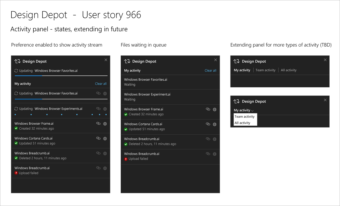
We knew all along that metadata (beyond the automatic) would be crucial for findability and preserving context around designs—but how could we get designers to contribute? We knew our sad info panel wasn't going to cut it. We found a QuickView design pattern on sites like Pinterest and we had a direction that also improved usability. By putting key metadata and its collection front and center in the QuickView, it would be seen in every crit session and managers could help uphold quality.


Outcome
UNI 2.0 is now an integral design tool at Microsoft with more and more teams onboarding; designers report greater job satisfaction, with less time spent hunting down and saving out files. The product continues to be funded for the exponential returns it provides in a more efficient design process.
Final Designs